Publishing content on the web is amazing. It’s an intricate dance between gathering ideas, thinking intensely, editing obsessively, shaping and molding words and images into something coherent and beautiful. And then, finally — INSTANTLY — sharing your creation with the world. It’s exhilarating.
But publishing also happens under stress. Moments after a legal threat, or a boss insisting you learn something new tomorrow. Sometimes it’s late at night, drinking too much coffee, or too much wine, or too much something. Often, it’s the last ::click:: in a long process, and hitting “submit” is cause for great celebration, and perhaps a sigh of relief.
The art of publishing usually happens in a content management system (CMS). Endless choices about color, fonts, microcopy, button shapes, labels, or animations impact how you feel before, during, and after publishing your work.
When done right, a CMS anticipates your problems, whisks you to solutions, and makes you feel smart along the way. Achieving this is the result of a synthesis between a willing client, an exceptional system, and a thoughtful developer.
For these reasons and more, choosing a system to build your website with can be contentious. It’s not an easy choice. There are dozens of reasonable options, and the wrong CMS at the wrong time can ruin a project, or even sink an entire business. The stakes are high. So let’s dig in a little.
Surveying the field
Let’s begin by examining the term “content management system” and dissecting what it means. At its most basic, managing content is a form with a single field. If you have edited a Facebook update, you have managed content and are technically qualified to administer a CMS.
These systems usually run on a website and allow editors to format type, select related content, and interact with pictures. There are endless variations of this basic concept. It’s a lot like cooking, with the same essential ingredients mixed up into different combinations depending on whether you’re making burritos or noodles.
A CMS is the nervous system of a website, enduring through ebbs and flows of growth and surviving constant change. Site administrators dip in and out of the system several times a day, with every interaction either amplifying delight or intensifying discontent.
These days, most popular systems can handle 95% of what you might need. So to help narrow things down, let’s break down our options a bit more.

Get up and running extremely fast with DIY design tools for a small monthly fee. Almost all your attention can be on the words and pictures. Capability is intentionally restrictive so you can’t break things. Great for starting out, or trying a new idea. More powerful than you might expect.

The purpose of a theme is to allow style to exist independently of the content. As long as the theme follows the rules of the system, you can quickly swap in a whole new look. Great if you don't want to build your own designs from scratch. Mostly free open source software.

Boutique
Designed for flexibility, complex data models, cross-referenced content, and professional art direction. These systems are ideally suited to custom, optimized, and responsive designs.

Certain features or types of sites require a lower level of customization, but with these systems you’ll need legit programmers and plenty of time. These often augment a Themed or Boutique site, or have evolved from a proof of concept developed more quickly.
How we chose a system
Gridwork builds about a dozen content-managed sites a year. Each one is custom-designed, and most have a 5-10 year lifespan. As much as possible, these sites need to share a common system we enjoy using and a structural philosophy we can live with. Among some other great options, for my needs Craft has the right mix of capability, roadmap, and attention to detail.
The entire experience is beautiful, from the initial setup to installing updates, seeking support, and building pages. It’s reassuring and reliable, and it delivers that elusive feeling of empowerment and control.
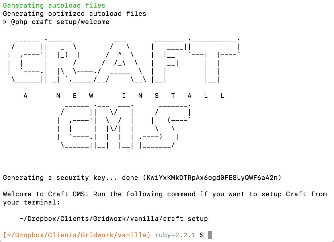
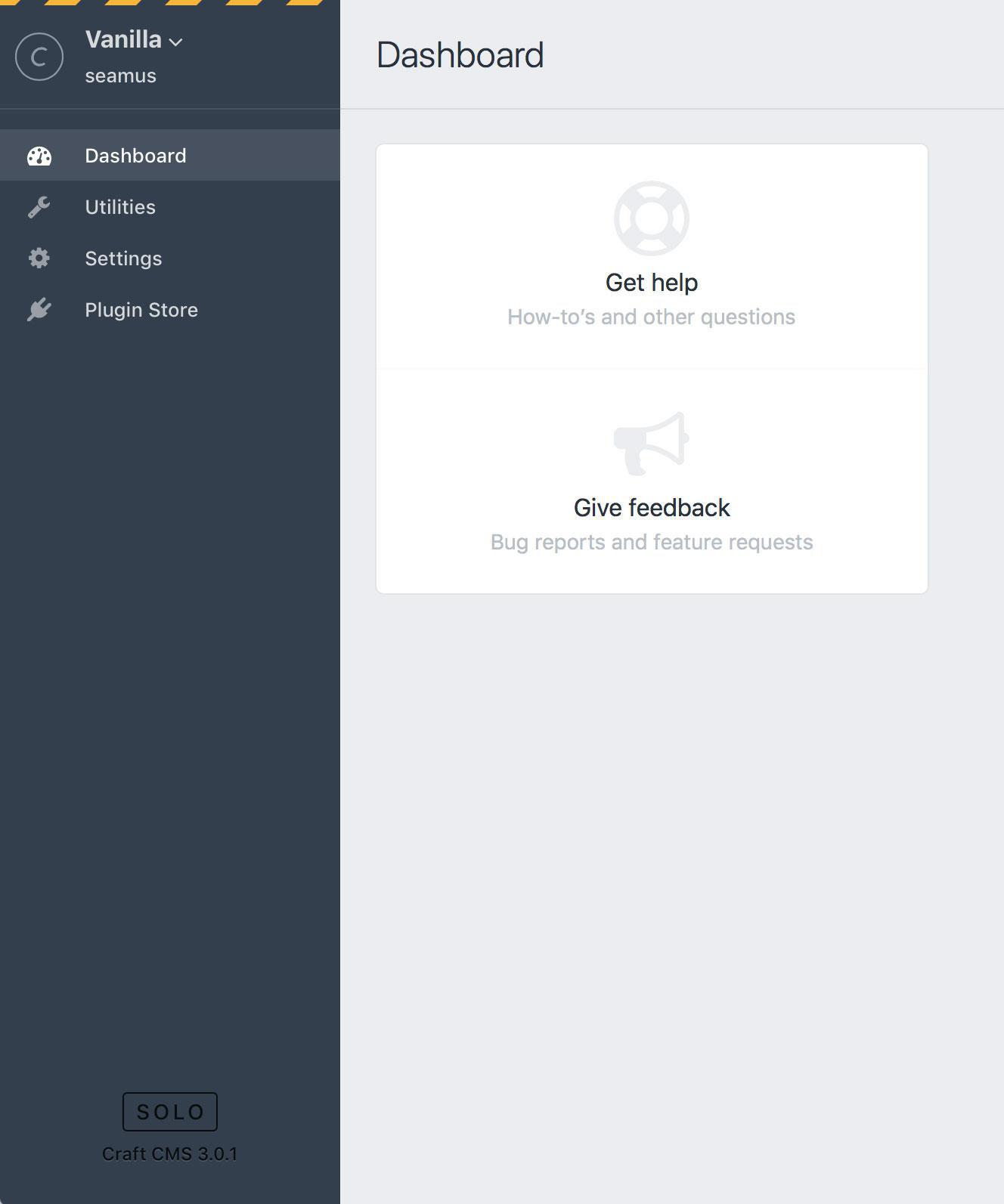
A fresh installation takes you through a few basic questions in order to configure and secure your system. Most of the default settings can be left as-is. Then you’re left with a deceptively blank slate.
Fortunately, it doesn’t take long to go from nothing to a suite of custom sections, fields, assets, and categories that weave together to form unique data models. Admins and editors can then write, relate, edit, crop, delete, rename, and reorder content to perfection. It’s surprisingly fun to set it up, and you’re left with the same feeling of accomplishment as assembling a complex jigsaw puzzle.
Defining “well-designed”
Those good feelings after a successful setup are precious and fragile. They depend on a consistent, battle-tested interface, and reliable resources to quickly right the ship when you’re underwater. With content management systems, it doesn’t take much to flip from euphoria to misery.
Like all art, the parameters of good design are subjective and largely depend if you are in the target audience. My tastes for CMS design involve a blend of details that help to get the system out of the way so I can focus on the content that matters.
Accessibility is the most important component of great digital design. If you can’t use something, or if it hurts to use it, then all your other effort is wasted. Beyond baseline standards compliance, I want plentiful keyboard shortcuts, night mode for reducing eye strain, and super-efficient UX patterns to minimize scavenger hunts for the setting you need. And for the love of god: big fonts. I am in these systems all day, every day: these details matter for reducing stress on our aging wrists, eyes, and brain cells.
Next on the hierarchy of website needs: microcopy. This encompasses all the nav items, button labels, and elements that sit alongside content. The language throughout the interface should use precise words and phrases that are specific to the content being managed. Clarity is more important than rules, but my starting place is nouns/objects for nav items and verbs/actions for buttons, one word if possible.
The goal should be to reduce cognitive overhead to the point that the UI melts away and your focus can remain entirely on content creation.
Finally, and somewhat obviously, great design is beautiful. That means the typography, spacing, and color work in harmony to denote hierarchy. And boy does a CMS need clear hierarchy. Between all the form fields, labels, tabs, titles, and categories (not to mention the content itself), it’s an avalanche of information to organize. For that reason, I’m a big fan of minimalist interfaces, monotone color palettes, and as little ornamentation as possible.
While Craft hasn’t nailed everything yet, once you get to know the nuances and history of Pixel & Tonic, it becomes clear that there’s a consistent, underlying philosophy about what a CMS is, what it should be responsible for, and how it can be safely extended and deployed.
Some highlights:
Rad previewing
Visualize edits in real-time.
Modular content
Art direct with a drag and a drop.
Multisite
Multiple languages and multiple domains.
Constantly updated
Healthy systems undergo constant iteration.
Occasionally extendable
Thriving third-party marketplace.
Insane forms
Convert visitors, collect information.
First-party commerce
Shop, credit card process, ship, tax, and more.
Super-duper fast
Zip. Zup. Zat.
Ownable
Ultimate in flexibility & portability.
Reflections on community
Like much of tech, the community around Craft is disproportionately white men, myself included. It’s frustratingly exclusionary. And it’s a damn shame too, because these are skills that can be self-taught, well paying, and for the right type of nerdy, OCDish person, richly rewarding. The lack of diversity suppresses essential points of view, excludes exceptionally talented people, and ultimately diminishes the quality of our offerings as web professionals.
As in any CMS market, there is a unique mix of personalities among creators, bloggers, developers, and advocates. It’s part of what makes the whole product. They are who you hire for difficult problems and big projects, who you call for support, and the writers of what you read to become an expert. Craft is blessed with a generous, interesting community. As an active member, I hope it’s welcoming, but I can’t really be the judge of that.
It’s also commercial software, so you can submit a support request right from the control panel, and a paid expert who works for Pixel & Tonic will help you out. The level of service for the price of entry is ridiculous. That robust, growing community behind the product helps a lot, since they can and will intercept a lot of the common questions that might otherwise clog up the official support channels.


