A case study in hospital web design
Wyoming Medical Center
Hospitals can be incredibly confusing places. Endless, maze-like buildings, complicated medical jargon, mysterious insurance regulations, it all makes for some pretty big hurdles to overcome when you’re trying to forge meaningful patient relationships. On top of that, the personal circumstances for visitors are often extraordinarily stressful.
So it’s vital that websites for hospitals meet these challenges head on, anticipating the needs of their patients, providing calm reassurances, and quick access to the most essential information. Of course, a website alone will not solve the myriad communication problems that hospitals face. It also must coexist with the personalized support and care provided by the living, breathing humans that answer phones, create pamphlets, and greet patients.
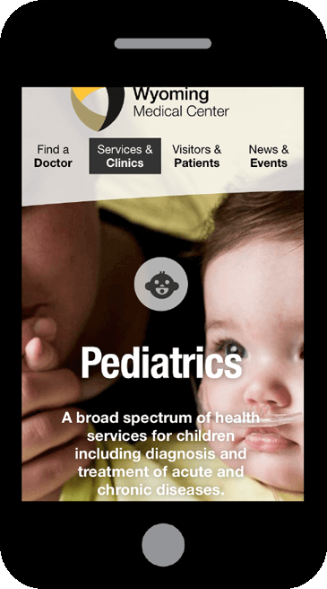
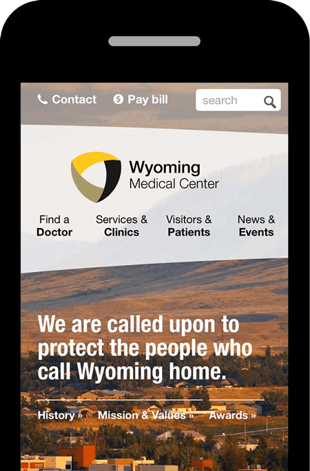
As the largest, most advanced hospital in Casper, the Wyoming Medical Center provides essential care to people across the entire state. They hired us to to redesign and unify three separate websites — applying and extending the best elements of a recent brand update.
Our Roles
- Analytics
- Content Strategy
- Visual Design
- Front-End Code
- Content Management
- User Experience Design